By Thornical Press –
December 29, 2025
The Bauhaus school, founded in 1919, transformed how artists and designers think about color by treating it as both a scientific system and a vehicle for emotional and spiritual expression. Rather than presenting color as an afterthought or purely decorative element, Bauhaus instructors integrated color study into the core curriculum, insisting that color relationships be learned through disciplined exercises as well as creative experimentation. This dual emphasis—rigorous analysis paired with subjective response—became the hallmark of Bauhaus color theory and continues to shape contemporary design practice.
The Bauhaus emerged from a desire to dissolve the boundary between fine art and craft, and color instruction was central to that mission. The school’s preliminary course introduced students to fundamental visual principles before they specialized, and color study was a major component of that foundation. Teachers such as Johannes Itten, Wassily Kandinsky, Paul Klee, and later Josef Albers each brought distinct perspectives that together formed a multifaceted approach: Itten emphasized perceptual contrasts and the psychological effects of color; Kandinsky connected color to spiritual and formal correspondences; Klee explored color through line and rhythm; and Albers investigated color interaction and relativity in a systematic, experimental way.
Johannes Itten’s pedagogy is often the first thing people associate with Bauhaus color theory. He developed a twelve-part color circle and a flattened color sphere—often called the color star—that mapped hues across gradations of light and dark. Itten identified seven fundamental contrasts: hue, light–dark, cold–warm, complementary, simultaneous (or optical), saturation, and extension. These contrasts were not merely descriptive; they were practical tools students used in exercises to test how colors change when placed next to one another, how they affect mood, and how they can be balanced within a composition. Itten also introduced the idea of subjective color experience, encouraging students to explore personal associations and emotional responses as part of their formal training.
Wassily Kandinsky brought a philosophical and spiritual dimension to Bauhaus color theory. His writings argued that color and form possess intrinsic emotional and symbolic qualities—yellow could be assertive and extroverted, blue introspective and infinite, red active and warm. Kandinsky’s approach treated color as a language that could evoke inner states and metaphysical ideas, and he encouraged students to consider how color interacts with line, shape, and composition to produce psychological effects. This emphasis on the expressive potential of color complemented Itten’s more systematic contrasts, giving students both analytical tools and a vocabulary for emotional nuance.
Paul Klee’s contribution to Bauhaus color thinking was less about prescriptive rules and more about process. Klee traced color back to the movement of the line—how direction, acceleration, and rhythm could mutate color relationships across a surface. For Klee, color was inseparable from gesture and structure; a palette was meaningful because of how it was organized through compositional decisions. His teaching encouraged experimentation with subtle shifts in hue and value, and he often used musical metaphors to describe color harmonies and dissonances. Klee’s work helped students see color as dynamic, capable of evolving across a piece rather than remaining static.
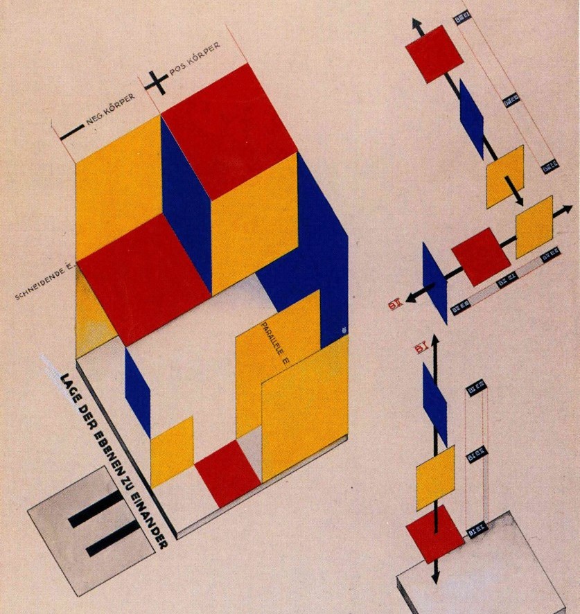
Josef Albers, who taught at the Bauhaus and later at Black Mountain College and Yale, shifted the conversation toward the relativity of color. Albers’ experiments demonstrated that a color’s appearance is profoundly affected by its neighbors: the same square of pigment can look different depending on the surrounding field. His teaching method relied on repeated, controlled exercises in which students placed identical hues against varying backgrounds to observe perceptual shifts. Albers distilled these observations into practical lessons for designers and artists: color cannot be understood in isolation, and successful color work depends on anticipating optical interactions and contextual effects.
Bauhaus color instruction was intensely hands-on. Students painted swatches, arranged color chords, and performed exercises that isolated single contrasts—such as pairing complementary colors or testing warm versus cool relationships—so they could internalize the effects. The preliminary course’s exercises were deliberately structured to move from controlled studies to freer, more subjective work, enabling students to apply technical knowledge to creative problems. This pedagogy produced designers who could both calculate color relationships for functional purposes (for example, signage and product finishes) and harness color for expressive ends in painting, textiles, and architecture.
The Bauhaus approach made color a tool for problem-solving across disciplines. In architecture and interior design, color was used to modulate space and light; in graphic design, it clarified hierarchy and readability; in product design, it signaled function and brand identity. Because Bauhaus training emphasized transferable principles—contrast, balance, and interaction—graduates could apply color theory to industrial materials, textiles, and urban environments. The school’s insistence on marrying theory with craft meant that color choices were informed by both perceptual science and material realities, a combination that proved especially influential in modernist design and in the later development of corporate identity systems and wayfinding strategies.
Bauhaus color theory endures because it offers both a vocabulary and a method. The vocabulary—terms like complementary, analogous, warm/cool, and saturation—remains foundational in art and design education. The method—systematic exercises, empirical observation, and iterative experimentation—continues to inform how designers test palettes and predict perceptual outcomes. Contemporary digital tools and color-management systems owe a conceptual debt to Bauhaus thinking: whether calibrating screens, designing accessible color contrasts, or building color systems for interfaces, practitioners still rely on principles first codified in those early classrooms. Moreover, the Bauhaus model—combining rigorous study with creative freedom—remains a template for teaching visual literacy and for fostering designers who can move fluidly between theory and practice.
Bauhaus color theory is not a single doctrine but a constellation of approaches that together teach how color behaves, how it feels, and how it functions. From Itten’s structured contrasts to Kandinsky’s spiritual correspondences, Klee’s rhythmic mutations, and Albers’ experiments in relativity, the Bauhaus offered a comprehensive education in color that balanced analysis with intuition. That balance is the school’s lasting gift: a way to think about color that is at once disciplined and imaginative, precise and poetic. Contemporary designers and educators continue to draw on these lessons, adapting them to new materials, technologies, and cultural contexts while preserving the core insight that color is both a measurable phenomenon and a profoundly human language.
Feature image: Mechanical Stage Design (1925) – Schmidt, Joost.